


10 Must-Haves for the Perfect Landing Page

How to create a selling landing page.
Spoiler alert: there is not ideal. But this does not mean that one should not strive for it.
Let’s figure out what a landing page is and what mandatory components a landing page should have
Landing page – what is it?
Landing page, or landing page, is a page on which a visitor must perform a targeted action: purchase a product or service, leave contacts. When developing a landing page, it is important to understand the psychology of the client in order to push him to the desired action.

How to create a landing page
The ideal landing page is a high converting sales landing page, not a page with a good copy or pretty pictures.
Work on a landing page begins with a marketing analysis of the product, target audience, competitors. You need to understand where you are unique and which offer will attract your audience.
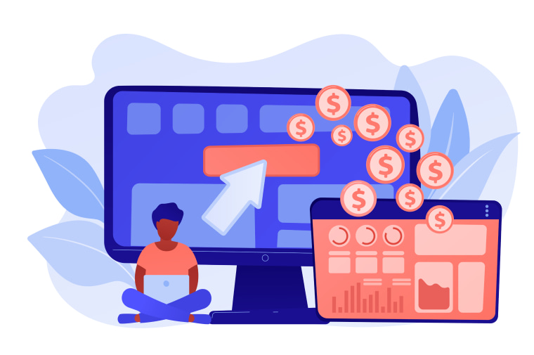
The next step is to develop the structure. There is no universal formula for the perfect landing page. But there are ten essential ingredients to consider. We will consider them in detail. And web analytics systems will show how good the landing page is.
Required elements of a perfect landing page:
#1. Thoughtful hat
A hat is the first thing a visitor pays attention to. Placed here:
- logo and slogan – work for recognition
- descriptor – helps to understand where the visitor got to
- menu – simplifies navigation
- contacts – make it possible to immediately contact
- button – for quick conversion action
Different elements are needed depending on the specifics of the business and the target audience.
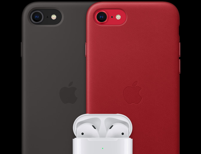
For example, on the landing page of the iPhone SE – a menu and a button, and instead of a logo – the name of the product.

# 2. Catching the first screen
The task of the first screen is to hook the visitor, to stimulate him to study the offer on the landing page.
The first screen should contain:
- header – contains USP (unique selling proposition) or offer, gives an understanding of what is offered on the landing page, what problem they can solve
- subtitle or bullets – reveal the essence of the proposal, promise benefits, promise results
- high-quality image, relevant to the text, – shows the product, strengthens the credibility of the company
Apple landing page is a special case. They are confident that their product is already the best, so they create an atmosphere and affect emotions on their landing pages.

# 3. Life-changing product
On the landing page, you should not just talk about the product, but show it in the context of the buyer’s daily life: how the product will change life for the better.
Write more about benefits and benefits rather than properties. The landing page may contain the following elements (what to choose depends on the product):
- product characteristics
- block with problems that the product solves
- block with advantages over analogs
- block with benefits
- cost or tariff comparison, calculator
- quality assurance
- product receipt process
- terms of delivery
- portfolio, cases
- product reviews
Let’s consider the nuances of product presentation on the landing page.
Specifications and properties are important to present to the client’s world. On this landing page, Apple could indicate battery capacity – but that doesn’t tell the average person much. But “all day without recharging” is a clear benefit. “It fits easily in a backpack” – immersion in the context of the customer’s life.

#4. Trustworthy company
If the brand is unknown and a buyer who does not know about you ends up on the landing page, you will have to gain his trust. You can do this with:
- information about the company – how long has it been working, what it specializes in, what success has it achieved
- photos of the director and the team
- guarantees
- lists of well-known partners and clients
- reviews
- cases
- office address
#5. Single targeted action and clear appeal
There should be only one conversion action on the landing page – so that the user doesn’t get confused. Sometimes, in order not to miss a lead, they add an alternative action – for example, subscribe to a newsletter. But so that it does not overshadow the main thing.
# 6. Simple application form
People don’t like filling out long forms – the fewer fields, the better. Request only the information you need. Ideally, limit yourself to one field.
To increase conversion, the form was reminded of the benefits of the offer. They also highlighted prompts so that the user does not get annoyed if the phone is entered incorrectly.
# 7. Visible button
There is no perfect shape or color for a button – these factors need to be tested. As well as the number of buttons and their location. But they definitely need to be noticeable and contrasting. It’s good when the label on the button duplicates the call.
#8. Clear and concise language
A few rules of good writing:
- more “you”, less “we”
- “No” to stamps and bureaucracy
- concise sentences are better than long ones
Apple landing pages are a great example of the above. It couldn’t be more laconic, isn’t it?

#9. Attractive visual content
Visual content is important. They always pay attention to images, so they should be of high quality and large. Don’t use stock images. Ideally, show real product photos.
With products, everything is simple – show the product from all sides and its use in everyday life. Rate the quality of product photos on Apple landing page:

You can show the service using photos of the work process, team, clients, experts, results of use.
If possible, use video content – reviews, instructions, presentations. Infographics work well – they grab attention and help tell the simple things about the complex.
# 10. Easy design and adaptive layout
Landing page design helps to perceive text and visual content. Basic Rules:
- the design should be light, “airy” – with space between blocks
- use one style
- choose a harmonious color scheme and contrasting text in relation to the background
- use easy-to-read fonts, eye-catching headings, subheadings, and accents
It is important that the landing page is displayed correctly in all browsers and on all devices – the share of mobile traffic is growing every day.
(3 votes, average: 5.00 out of 5)Popular news