


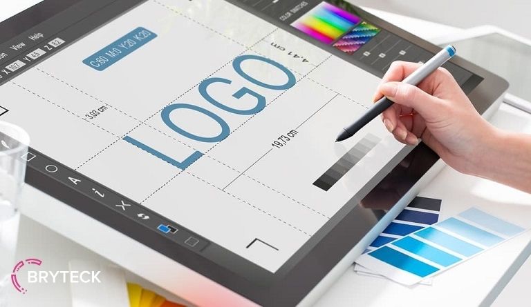
Logo design. Part one

Today we start talking about logo design.
In my opinion, this is one of the most interesting topics in our profession.
The topic is quite extensive, and it is impossible to cover it entirely within the framework of one or two posts.
Therefore, I will tell you about the basic concepts and stages of logo design, and in the next post I will demonstrate the workflow itself, from idea to implementation.
So what is a logo?
A logo is one of the most important elements of a “corporate identity”, the task of which is to distinguish a company or a product from their own kind, and to create a recognizable image in the eyes of consumers.
But ultimately, a logo is an emblem.
It can be a simple combination of letters and numbers, geometric shapes or elementary images.
Creative process
The first important stage in design is getting primary information from the client. This will help you to define for yourself the main task of the project.
In professional language, this is called writing a “brief” – a summary of the project. Before getting started, try to understand what exactly the customer expects from you. What are its goals? Remember that logo design is not done in a purely intuitive way.
Gather the information you need. To work successfully, you need to be familiar with the customer’s field of activity. Sources of this information can be books, articles. Internet … and, of course, the customer himself.
An example from life.
In the work on the first version of the logo for the new Internet advertising service “Crowda”, I was helped by 2 main facts that I knew about the company:
1. Business exists exclusively on the Internet.
2. Business is a completely new, unique advertising marketing model.
One of the options looked like this:

The letter “a” – the first letter of the alphabet, stand out from the whole name with color and shape. It is shaped like a “dog”, the most used symbol on the Internet.
In addition, the word “crowd” is translated from English as “crowd”, “crowd of people”. The popular expression “Stand away from the crowd” means: to stand out from the crowd, to be different. ”
So we got the word “Crowd” with an unusual ending “a”. The idea itself is not very original, but the customer chose this particular option.
- Find visual aids.
Find logos made for similar companies and investigate their style, technique, accuracy of the expression of the idea. Try to determine if these logos are successful or not. Substantiate your findings. If you like the logo, take note of the style and structure of the logo and collect photographs, color combinations, fonts or their elements and other materials that you think will help you decide on the idea and style of your work.
- Make pencil sketches.
No other computer graphics editor can compare to pencil sketches for the freedom and speed of displaying an idea! Starting your design right away on the computer, you deliberately limit your imagination and risk getting stuck halfway.
First, understand what you are going to do, and then decide how to do it. Personally, I work according to the principle: design on paper, execution on a computer. Try it too – and you will immediately feel that work has become easier and more interesting.
- First, make a black and white version.
As I already wrote, the logo should be well received, regardless of size and color. To achieve this, always start with black only; color is too subjective and emotional.
Often, color can weaken the perception of the entire design as a whole. For example, when you look at a bright red logo, you instantly react to its color, and not to the design elements. Therefore, bring to mind the design of the black-and-white version of the logo, and only after its approval by the customer, start looking for a color scheme.
- Create a logo in vector format.
Vector graphics programs like Adobe Illustrator, FreeHand, Corel Draw create graphics based on mathematical equations, while bitmap graphics editors like Adobe Photoshop use image pixels so that our logo can be enlarged or reduced without loss quality, you need to create it in vector format. In addition, in preparation for printing, vector format is always one hundred times preferable to raster format.
- Simplify!
One of the most well-known design principles is: “The simpler, the better!” Simple logos are easier to remember and convey ideas more effectively. Remember that a potential client of the company should see your logo on a billboard, even while passing by at a speed of 100 km / h, or distinguish it on the packaging of goods on overflowing store shelves.
This is why most of the world’s most famous brands have very simple logos. Follow their lead – simplify your design!
- Complete the logo in color.
Choose logo colors based on your target market. Remember that these or those colors tend to give in to fashion trends. Such “trendy” colors can suit a young dynamic company.
But, for example, a jar will suit a more conservative set of colors, which will serve it for a long time. Try to reduce the set of colors to two or three. Remember: the smaller and simpler, the better !. In addition, the use of a large number of colors only increases the cost of the project and complicates its production.
- Submit the final logo design for customer approval.
- Get cash rewards and have a fun party!
(3 votes, average: 5.00 out of 5)
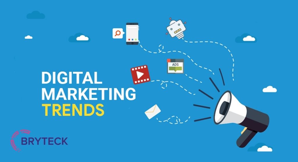
According to recent statistics, half of all internet users claim that the design of a website is directly related to its credibility. In other words, people almost instantly judge a website by simply looking at the way it looks. A stylish and up-to-date website generates new leads. While a poor and out-of-date website, in its […]
There are millions of people and companies in the world capable of designing a logo, from freelancers on Upwork to global advertising agencies. But what separates a good performer from a mediocre one? We learned from the IntlTech Digital design team what distinguishes a good logo from just a beautiful picture. And what is important […]
Popular news